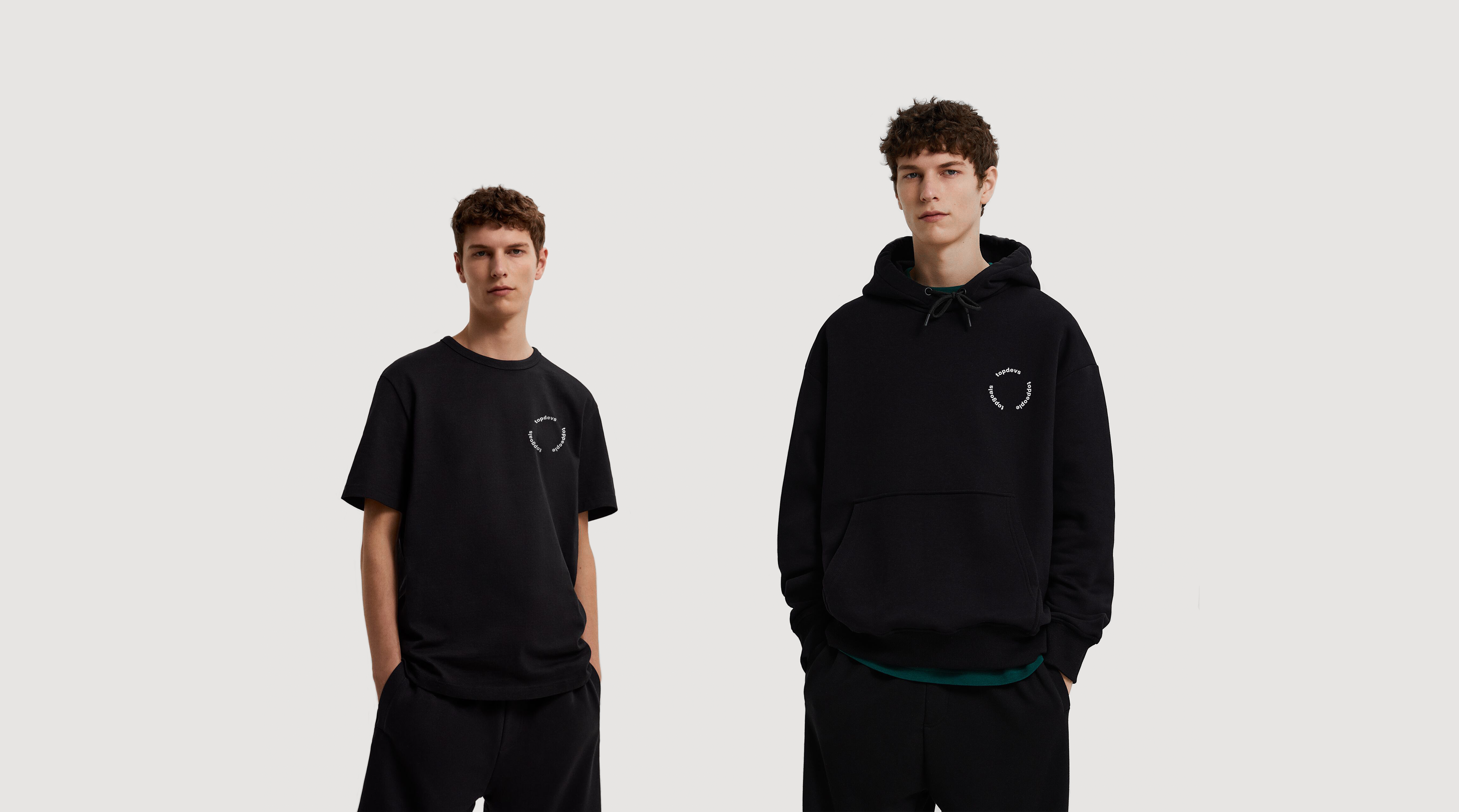
The main tasks were to create merch for a wide audience of the company, and not to use the company's logo in the design, while maintaining the company's recognition.
The idea of creating a round symbol that begins and ends with the name of the company. The cycle can be traced in every word of the slogan and the slogan itself seems to be looped. The Toppeople is an endless cycle of new people in the team who become new team members or leave the company. Togoals is the flow of the company's goals in creating new projects to reach new heights. Well, Topdevs itself is a cycle of creating applications and, in general, tasks related to creating applications, which is repeated all the time. And the circle is just the best shape with which you can associate a cycle.
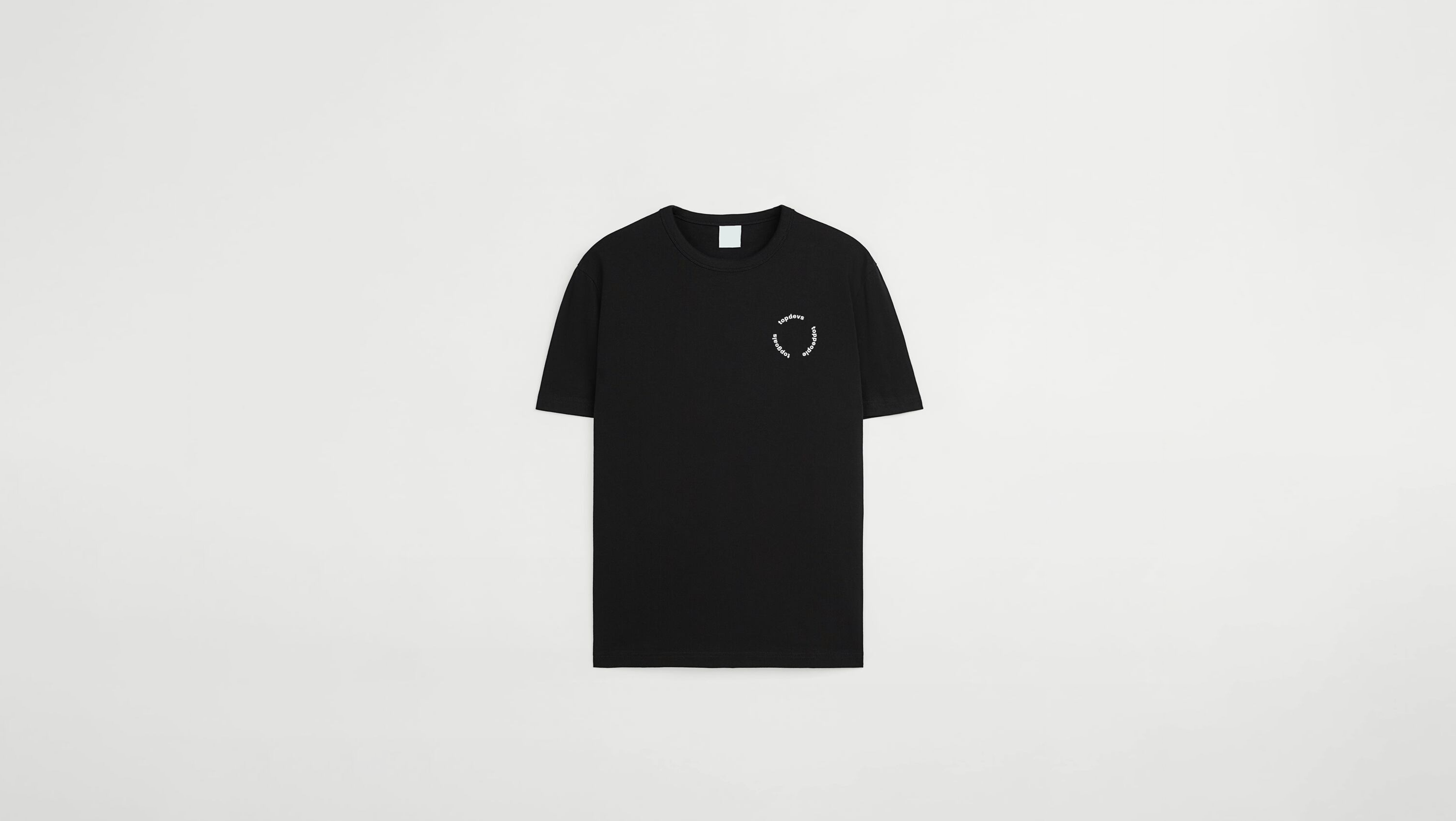
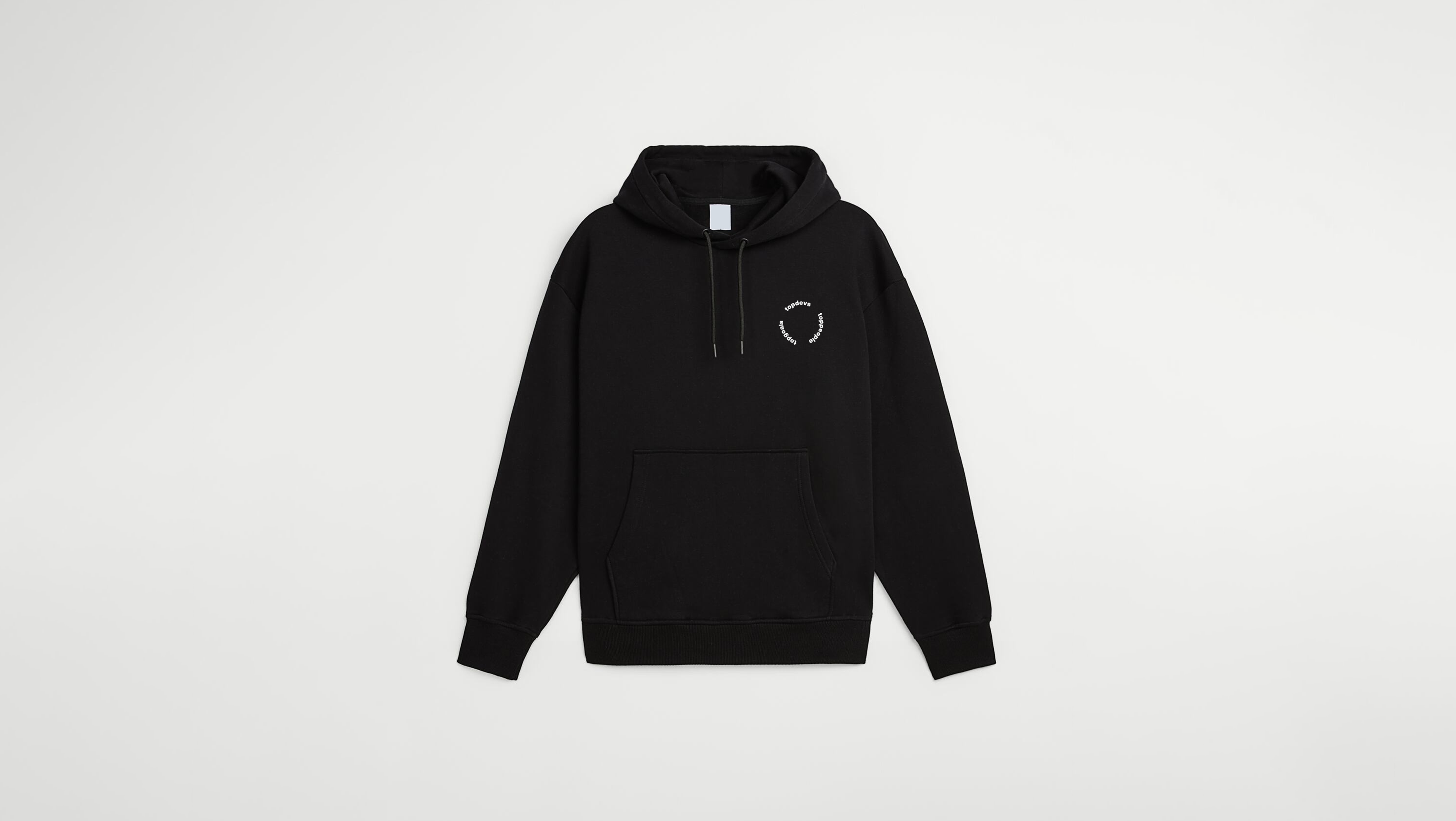
Design was based on the slogan of the company Toppeople, Topgoals, Topdevs, why the slogan? Because the main task was to create a design that would be associated with the company but without using the company logo and leave the design recognizable. Therefore, it was decided to take the slogan as a basis.
Above are the design options for Hoodies and T-shirts, both items are unisex, in order not to make different options for girls and men and to preserve the versatility of both design and clothing.
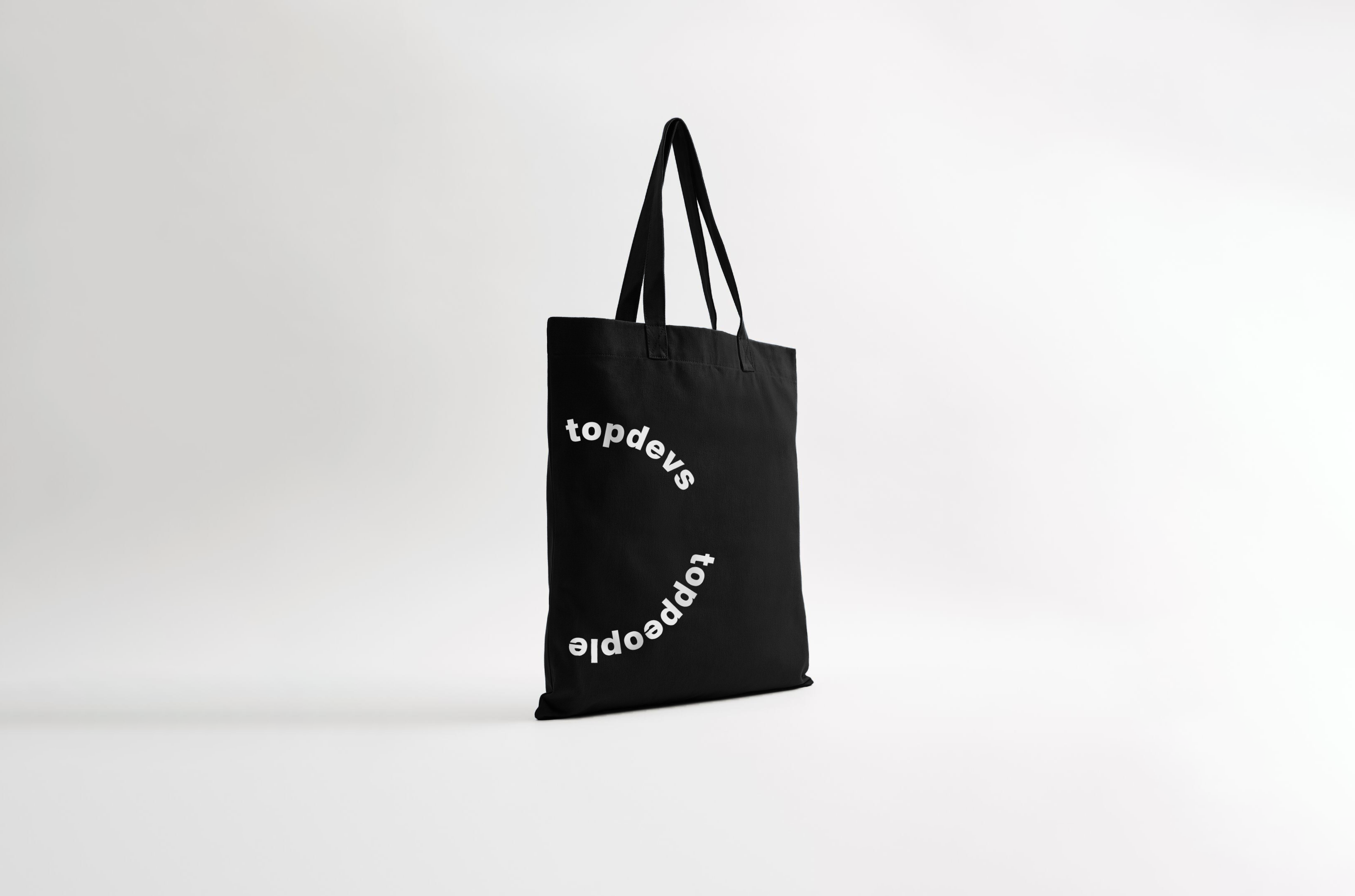
The shopper also features a symbol on both sides. This composition was chosen to maximize the size of the symbol and improve readability. In order not to make a pattern, but to leave one symbol and preserve the style, it was decided to make parts of the symbol on both sides, but at the same time to divide the symbol precisely on the spaces and not on the words, so that individual words could be read. The more you fill the contents of the shopper, the more readable the symbol is displayed on both sides.
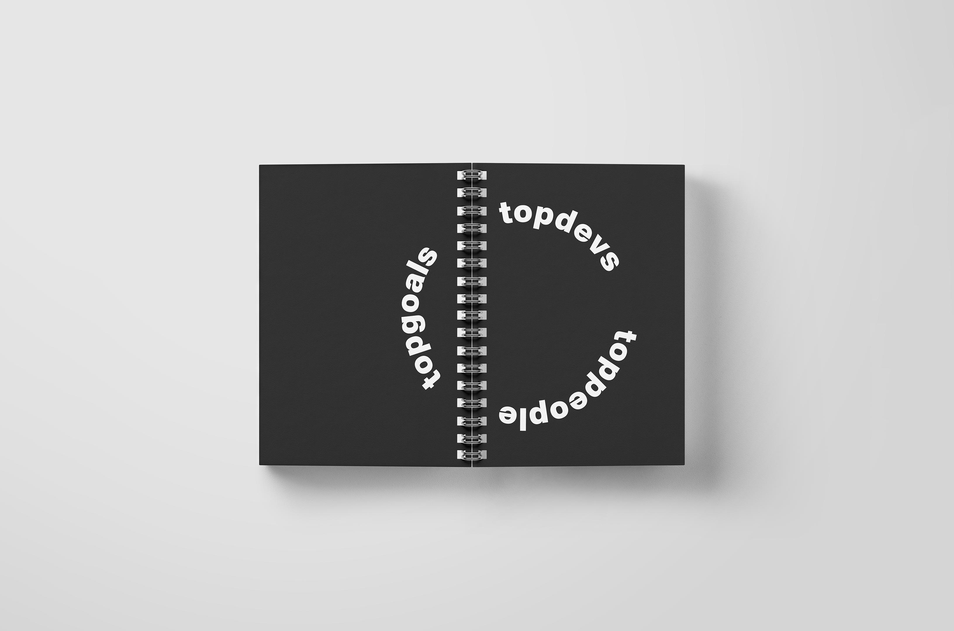
The composition solution for the notebook was made the same as for the shopper, with the only difference that the symbol is completely revealed when the notebook is unfolded and both sides of the cover are visible.
Another idea is that the word Topgoals can be read separately, because it can also be your personal goals, and by combining them with other parts of the symbol, a complete composition is formed.
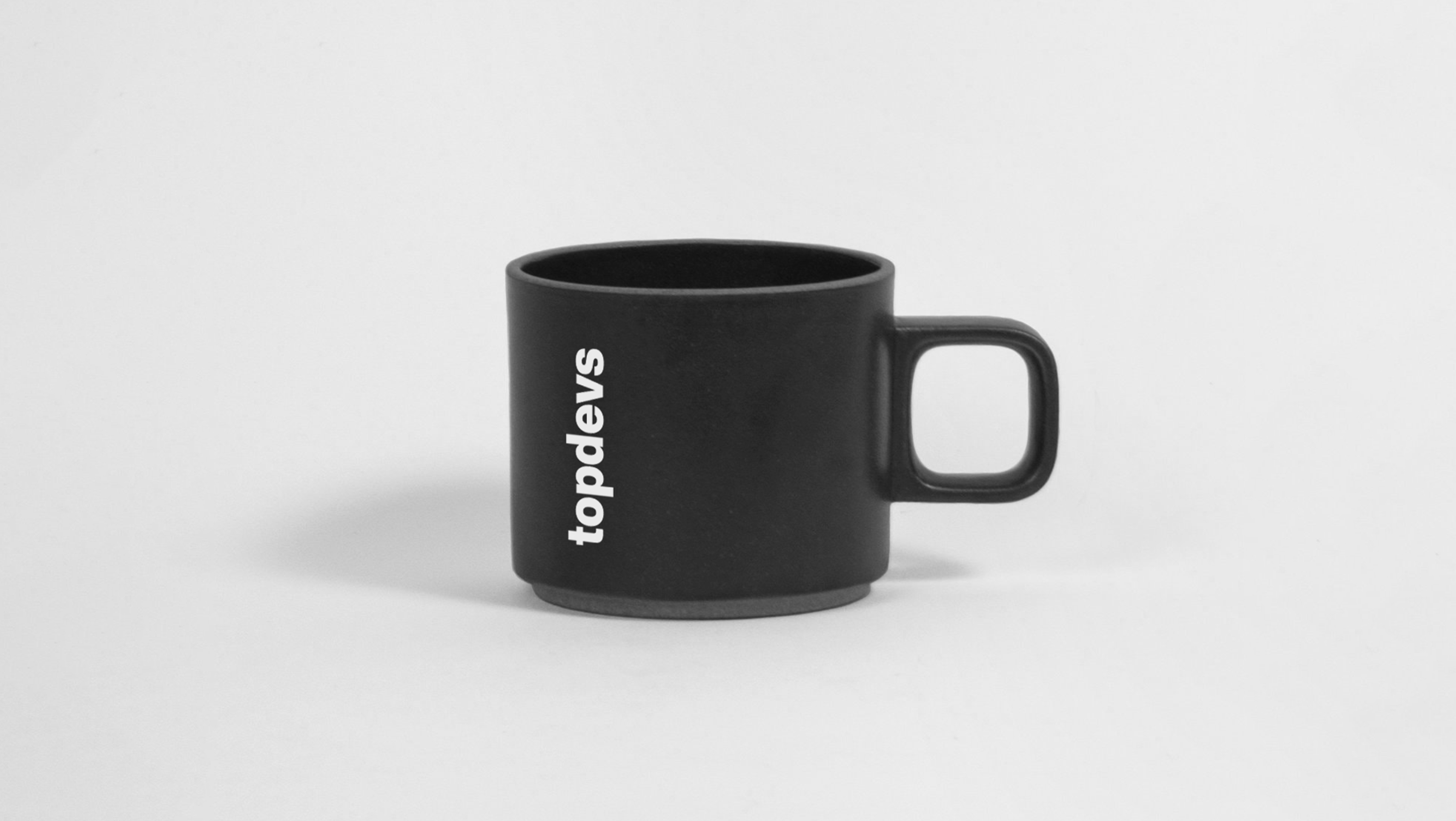
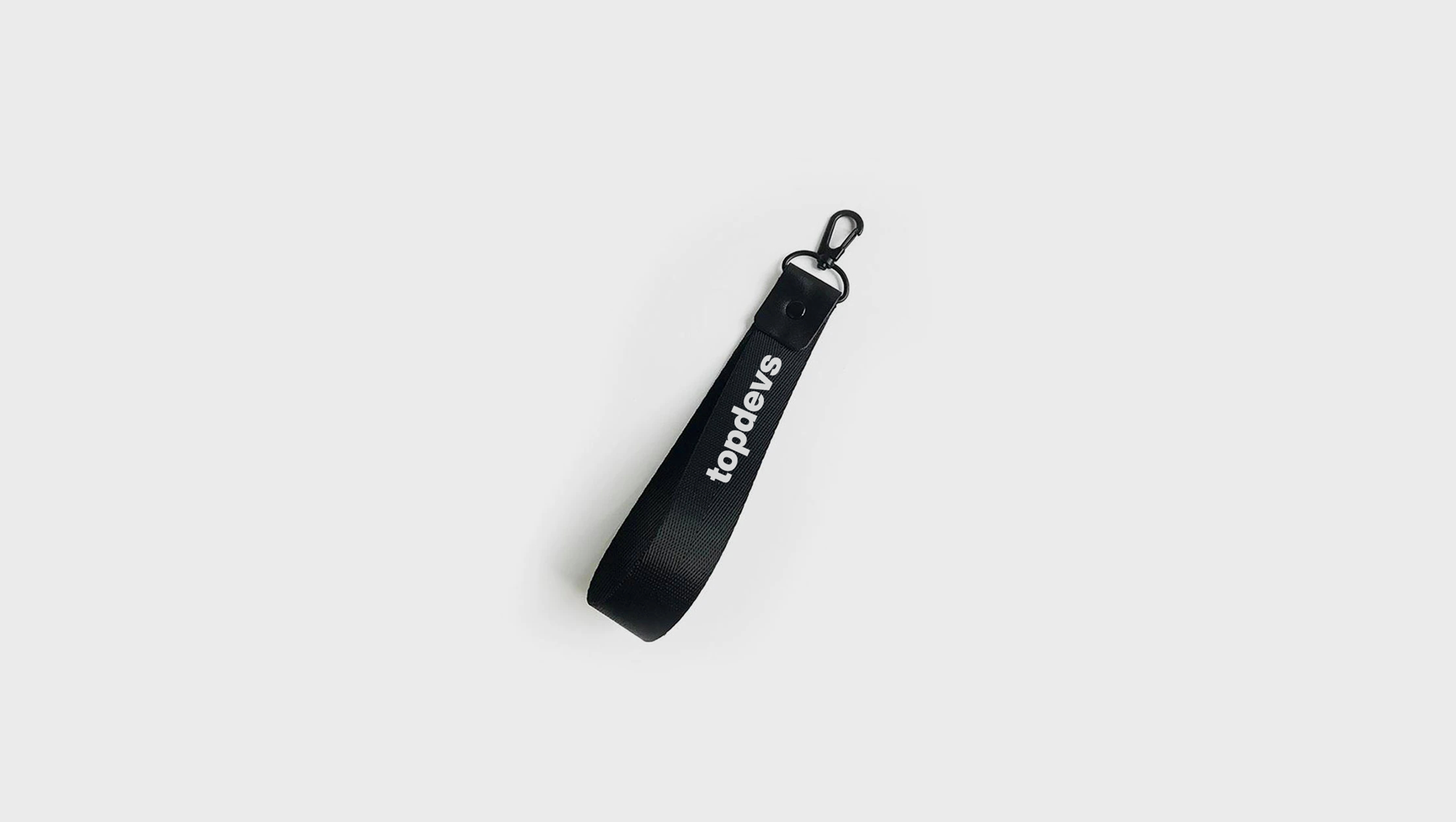
The only two items that only have the company name are the keychain and the cup. The keychain has only a name, because it is difficult to place the text in such a small space and maintain its legibility.
And the name remained on the cup because a composition with a vertical inscription is better than a composition with a circle. A circle would not look as good because the surface of the cup is browning.
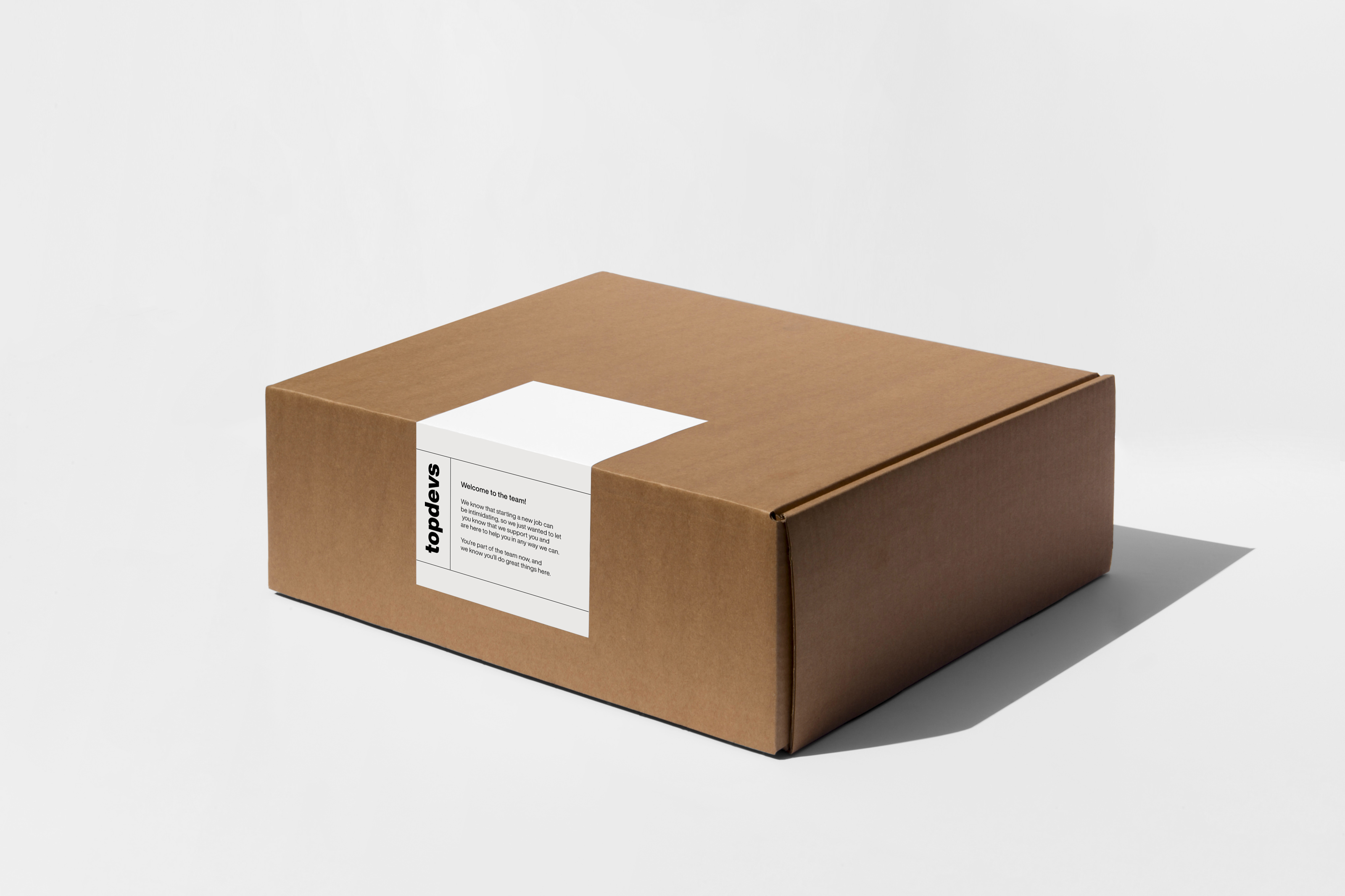
All of the above items were packaged in a box with a sticker in the style of merch so that it was possible to send a welcome box to employees outside the city or country.
As a result, various items were developed and used by the team quite actively in their work and in everyday life. They were warmly received by the team, and simplicity and minimalism were emphasized by the team as the main criteria they liked.